I like a lot of existing spreadsheet UIs, particularly Airtable's and Google Sheets. But I think giving the grid more space, gives the user the impression that everything maybe shouldn't be on-screen all of the time. It gives the impression that cells are the smallest unit of the sheet, but the grid itself (or worksheet, if you prefer) is a unit that is as much of an atomic-variable as the cell is.
Existing UI Pattern: Spreadsheet is container, worksheet is container, cell is
item.
Re-Imagined UI Pattern: Spreadsheet is container, worksheet is item, cell is
sub-item.
The existing pattern of flat structure at the cell level makes sense. Deeply nesting things makes it harder for users to conceptualize the intent of the interface. But controlled, and intentional depth can help users conform to good patterns. Making grids an item instead of a container can give them express intent in a way that having them be a nameable container can't.
Making grids fill the entire screen by default gives it an inviting canvas effect, and encourages users to fill whatever cells you need to do their work. But it also leads to grids that are more of a workspace, than a named entity. Is there an opportunity here to help users make better use of grids by making grids as small as possible by default?
General Layout
Here's how it generally looks when laid out with HTML tables, and a more modern flex-box.
An example using plain HTML table.
| A | B | C | D | E | |
|---|---|---|---|---|---|
| 1 | Date | Type | Minutes | Miles | Miles/Minute |
| 2 | 7/21/2019 | Running | 24.98 | 2.64 | 0.11 |
| 3 | 7/23/2019 | Running | 25.14 | 2.74 | 0.11 |
| 4 | 7/24/2019 | Running | 26.85 | 2.83 | 0.11 |
| 5 | 7/27/2019 | Bike | 48.00 | 8.40 | 0.18 |
| 6 | 7/27/2019 | Running | 27.25 | 2.88 | 0.11 |
An example using CSS Flexbox.
Now that I've got both of those done, it seems like the flex-box one is easier to update and change as I add more features and elements. That's the one I'll be working off of for the rest of this document.
The Nexus
The nexus is then {-1, -1} location where the column name, and row names intersect. It's the pseudo-origin of the table, but not the true origin, because you can't fill it with data. In many spreadsheets, it's how you select an entire grid/workbook/table, and in some, it has borders that allow you to see frozen cells.
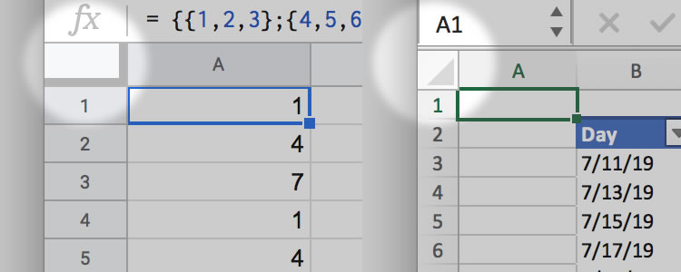
Google Sheets on left, Excel on right. Nexus is highlighted.
The purpose of the nexus then is to allow selection of the entire grid, just as you can select an entire column or row by selecting the header. It has a secondary purpose of containing unset frozen boundaries. Here's a number of ways to communicate those primary and secondary functions.
A simple box conveys that there's something you can do with this that might involve the column header and row header, and that something might be clearer upon hover. Hover not enabled on this example. Just working with static appearance for now.
By showing the draggable freeze-lines, we can inform the user there's a feature here. The select-all is implied.
Similar to the above example, but with an indicate that you can select this header.
Indicating in advance that this is a grid-selection. Freeze-lines absent.
Many of these achieve their goal, but aren't frequently used and aren't the only way of achieving their goal. How frequently will a user select an entire grid, and how frequently will a user move frozen columns? And are there alternatives ways to accomplish this? One way is to push the freeze lines into the header rows of the dimension they don't freeze.
Freeze Lines
If we ditch one of the functions of the nexus, then freeze lines can appear at the start of the header-row for column names, and header-column for row names.
Freeze lines on headers.
There are several benefits of dispersing the functions of the nexus. The first is that it pushes the freeze lines to where they will be used anyway; in the header rows. The second is that is removes the select-all function all together, since that is achievable by other means. Features that are in multiple places are a little confusing, and increase the surface area of the product.
What does the freeze line look like when it is at an index greater than zero?
Static example. No scrolling yet.
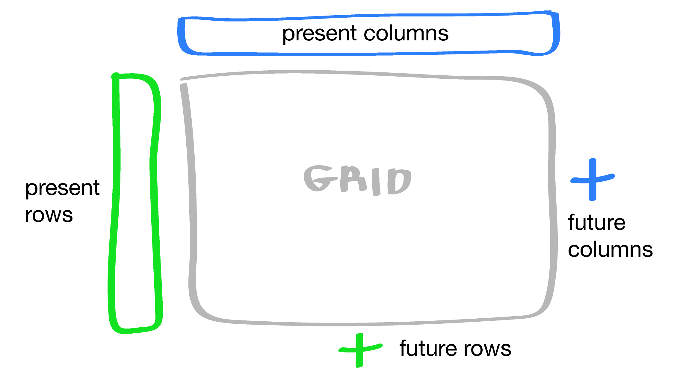
Grid Sizing
Just to reiterate the concept of the grid here:
Existing UIs: Spreadsheet = container, grid = container, cell = item.
Our UI: Spreadsheet = container, grid = item, cell = sub-item.
By changing the concept of the grid from a container to an item, we are encouraging the user to think of the spreadsheet as the workspace, rather than the grid as the workspace. This is to help the user think in terms of collections that occur in a tabular format.
With that in mind, is the grid a near-infinite space, like in Excel? Is the grid a functionally infinite space, like in Google Sheets?
Excel lets you scroll forever.
Google Sheets lets you make the grid very small.
The questions to ask when thinking about grid size is: Do these qualities make it easier to use spreadsheets? Do they promote good use? Do they reduce errors in your work? Do they reduce cognitive load? I think in all of these questions the answer is no. These ideas had value when users needed to have the idea of a workspace or "blank canvas of computation" communicated to them, but I don't thing that holds up.
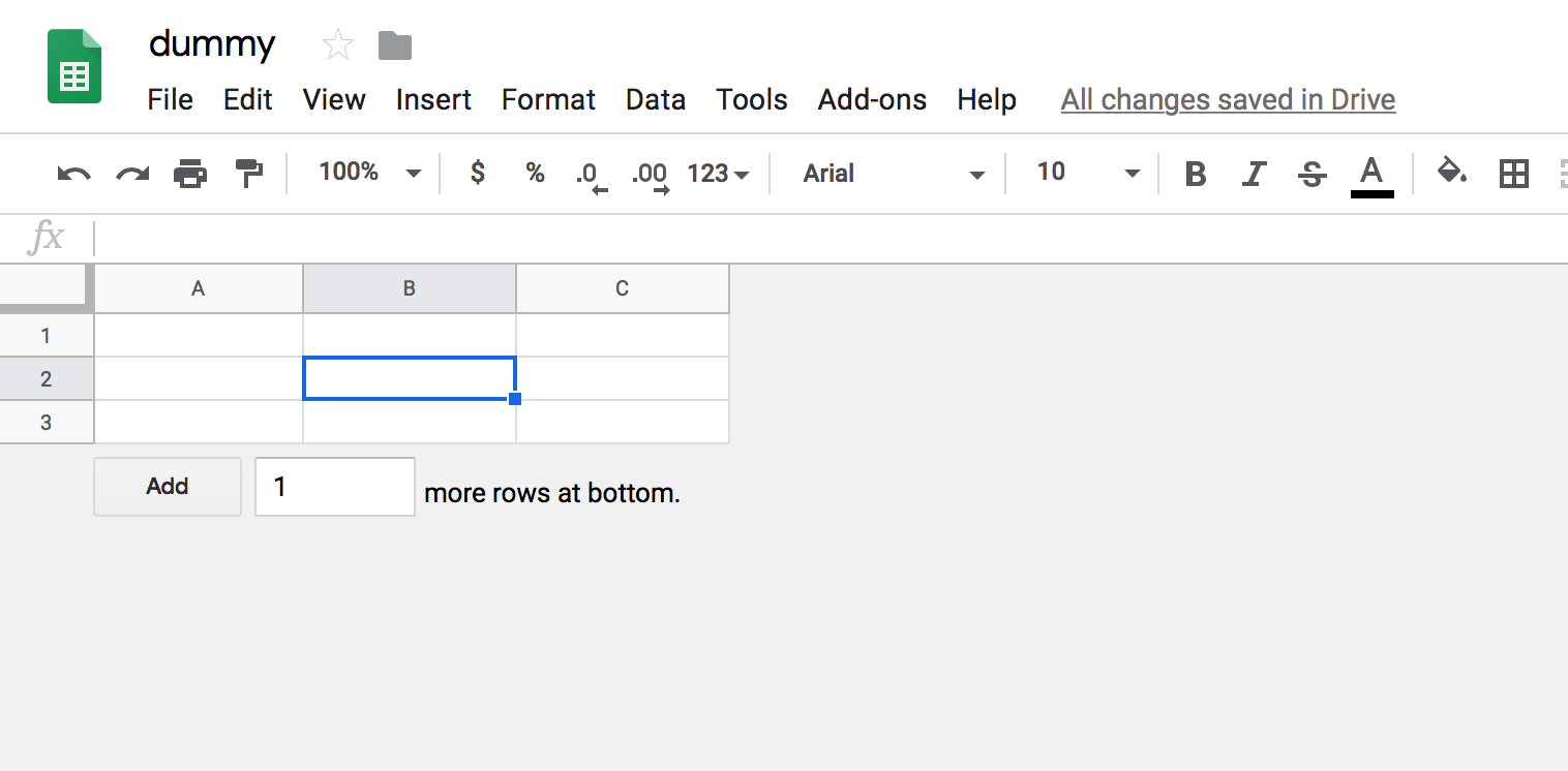
Airtable handles this really well by having the grid be as small as it needs to be, and has to because all columns are named. It's a "shrink to fit" style of grid sizing. Without introducing column types, and forcing the user to front load data-modeling decisions, is there a way we can encourage sizing that focuses on the grid's purpose?
In other applications that are document based, inserting a table requires you to define size up front, with the option of changing it later.
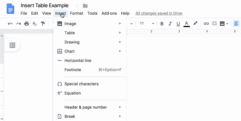
Insert a table of a specified size in a Google Doc.
This make sense when grid sizes are small, and known. Our grids might be large, and of unknown size. A good trade off between up-front sizing, and an infinite or large grid would is a grid that:
- Fits and fills the thing that holds it.
- Is a reasonable size.
- Expands when given data.
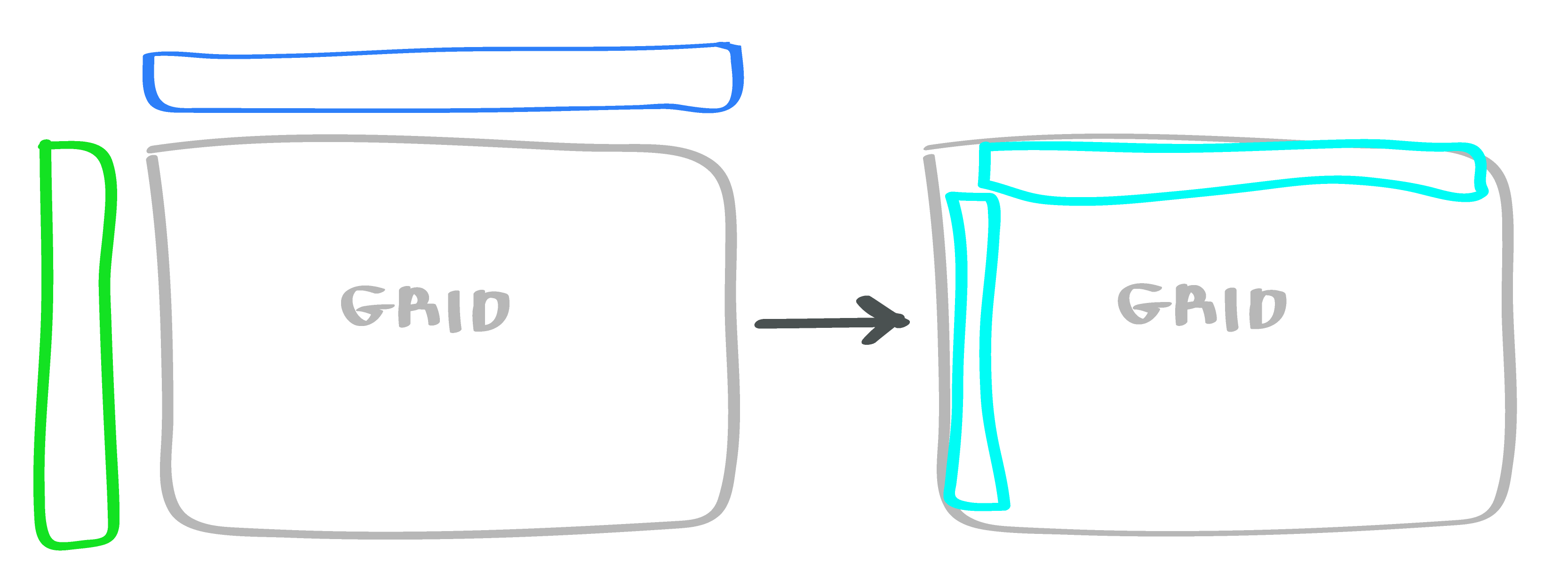
Basically, if we don't shrink the grid to fit your data, you will mentally do it, and you will have to enforce the mental model of your data-boundaries in other places in the spreadsheet when you reference that area.
This is difficult to illustrate clearly without the container, but it does bring up one more issue: How do we allow users to resize? I'm not a fan of forcing users to choose how many more rows they're adding (why should they have to know?) or secondary-click to insert a single column in one dimension (why should they have to repeat that?).
Adding rows and adding columns should be similar actions because they share similar intent: making the grid bigger. But the situations in which you want to add a column are different from the ones where you want to add a row; and can be inverted depending on how the user thinks of the major dimension.
With a lot of data sets, there's no clear correct dimension to pick. For example, this data set can be viewed both ways.
Row Is Increasing Dimension
Column Is Increasing Dimension
Actions like "Add 1000 Rows" assume a dimension that is changing faster than another. English is left-to-right, top-to-bottom, but data might not follow that structure. So we want sizing features to be easy to access, and equally prominent for both dimensions.
Perhaps here's a better way to think of it.
Colors
With some of the structure decided, how can we best utilize color? How can we choose a color palate that communicates distinct elements, their boundaries, interactivity, and the data model beneath. Here's what I've been working with in the above examples.
I chose these colors because they're close to the colors existing spreadsheets use, and while I was exploring structure, it's easier to see with the colors I'm familiar with. But now that we've confirmed a slightly different structure than existing sheets, what are colors that make sense? We need:
- Outer Border: The outer border that defines the boundary of the entire grid.
- Inner Border: The border that defines the boundary of a single cell.
- Header Color: The header background color for row and column headers.
- Cell Color: The background cell color. Likely white, but could be a different shade depending on the background color of whatever is containing the grid.
- Active Region Outline Color: The outline color for the cell region that is selected.
- Active Region Background Color: The background color for the cell region that is selected.
- Active Region Header Color: The background color for the row or column header for the cell region that is selected.
- Selected Header Color: The background color when an entire rows or columns are selected by selecting the header.
All of these colors need to be chosen with regard to their color in existing UIs, and their relationship to each other. Some colors, if next to each other, need to exceed a certain contrast level. Maybe an adjacency matrix would be helpful.
● = Yes
○ = Maybe
Blank = No
It looks messy, but this gives us a bit of information. Firstly, it tells us that outer and inner borders touch almost everything. Secondly, it tells us all other colors will be adjacent to at least four other colors.
We'll come back to colors later.
Scrolling
So far we've been operating under the implicit assumption that the user has an infinitely large screen. All of the design decisions we've made make sense, until we need to scroll the grid, and choose what stays on screen.
In existing spreadsheet UIs, you need to scroll because the data you're looking at extends past the bounds of the screen, or the grid itself is infinite.
Here's a couple of broad reasons for scrolling:
- User is looking for the boundaries so they can add or remove data. Eg: Adding row of data, adding a column of data.
- User is looking for the last entry where some function is taking place. Eg: Looking for summation row or column.
- User is selecting a row or column, and needs to find the boundary. Eg: Select A1, needs to find A1000 while holding shift. This could be because they're selecting a range for a formula.
Without taking reducing the freedom of the user, is there any way we can make any of these cases unnecessary or achieve through easier means?
For #1, we could add some sort of command-line like interface to allow users to prep a row, and add it, but doing this with columns is problematic because of the direction of type-flow, and even when we add it, scrolling to it and showing it is necessary. For #2, summation columns and rows could be handled by putting them in a different grid. But if there are too many columns or rows there, it's really the same problem. And #3 is a core feature of spreadsheets.
Basically, there's no way to eliminate scrolling. But I thought I'd just go through that one to see if there's anything there that can make the experience easier.
What elements of the grid stay with the view when the user scrolls? Without rows and columns, the user only has a relative sense of where they are, so they stay.
But beyond that, the question is what are we scrolling, and do fixed element "stick" or are they outside the scrollable container, but scrolling with it? The answer is probably both. The rows and columns need to stick in both dimensions in order to give the user context about the grid.
With the stickiness of the headers decided, it makes less sense for them to float. Giving the main grid space looks good without scrolling, but when we need to scroll, it quickly becomes cumbersome. Having the floating headers also looks similar to the ruler next to a Word document, giving the impression that the grid is still the canvas, which it's not.
How can we make the grid self-contained, and item-like rather than container-like? We can start by thinking of the grid as a unit.
We can also make the grid width and height fixed, or closer to fixed, or fitting their container. When we stop thinking in terms of containers, and start thinking in terms of items, we need the grid to be a specific size. If the grid contains enough items that it's difficult to scroll in a small size, there are ways to work around that.
Solidifying the grid allows us to remove some of the implied layering around the header colors, cell colors, and border colors. The entire grid is one single object. We end up with something like this.
You'll notice that the active column and row headers aren't highlighted. One of the benefits of a small grid is it's easier to see what your cell key is. However, we could easily turn on some sort of simple highlighting if the grid was expanded.
We still haven't fully addressed the issue of scrolling, so let's figure that out now. The next version needs to scroll in both dimensions, so we're bounding the dimensions, and adding some more data.
In this one we're using really simple javascript scroll events to lock the headers to the body of
the grid.
Interaction is still disabled. But this seems like a less-than-perfect way to do it. Is there a
way we can use
plain styling to get this same type of scroll-locking? My initial reaction is yes. We can use
something like
position: sticky; to get there, but then it becomes more tricky to do the rounding on
the inside top
left corner. This may seem small, but making the headers seem in-item, and not rule-like is a key
part of the design
of our new grid, and it's something I want to maintain.
Formula Bar
The goal we started with was to redesign the spreadsheet grid in a way that made it an item instead of a container. But sometimes the grid is holding formulas or other objects that have a different display than the underlying raw data. In existing UIs this is shown with a formula bar. But if our grid is an item, having an omnipresent formula bar makes a little less sense. While there will be time when we need that, having the "controls" for an item should exist with that item. What if the grid is in a document where there is no menu/tool bar for the formula bar? Or in a UI that has a different intention for the existing menu/tool bar? These are possibilities when the grid is an item.
So we need a formula bar that is:
- Optional
- Visibly associated with a grid.
- Shows currently selected cell key, or first cell key of currently selected range.
- Shows pre-computed formula or data of first currently selected.
It might look something like this:
This hits all of the requirements, but it feels like there's something missing. If we place this close to, or inside of the existing grid it is functionally apart of it. It shows both the current cell key and the un-computed value for the cell. The fx is equal parts convention and utility. It denotes that we're showing the un-computed and un-manipulated data or code that is stored at that location. But is there a better or clearer way to convey this? It's useful when the user is a first time user and we need to show that there are possible formulas per cell that are not displayed inside the grid. This is potentially useful if we have a canvas-like container grid that could be entirely empty in some cases, particularly the zero state case. But if the grid is an item and not a container, is that still the case? The grid as an item could contain empty cells, but in that case what does an fx symbol convey? Not much. It is also not useful as an interactive element of the formula bar. In Excel, clicking it inserts an equals sign to start a formula, which seems pretty useless, even if the user is a beginner. So let's ditch the fx symbol.
If we're eliminating the vestigial components of the formula bar, is there anything that we can re-think, improve, combine, or eliminate to better communicate information? The cell key is a potential candidate for improvement. In Excel it's used to show current selection, but it's also used to create named ranges based on currently selected ranges. It's also used to do the reverse: select a range that's already been named. We've not yet discussed named ranges but not might be the appropriate time. With the itemization of our grid, the idea of a named range doesn't go away, but it does change. By allowing grids to be items, instead of using a large expansive grid, it might be a more common pattern to create smaller grids that are referred to directly. But we can't eliminate the possibility of cell formula needing to refer to a named range that is a set of rows or columns.
Named ranges stay then. But do they deserve to be in the same place as the cell key? I don't think so. A cell key is the smallest unit of reference, while a range is a collection of cell key references. Inside a formula bar we need to show the un-computed value of the selected cell, so it makes sense to show the single selected cell, even when a range is selected. So it makes a lot of sense to keep the cell key, but not a lot of sense to show named ranges there as well. For now, we'll make the decision to keep named ranges, but to display them somewhere other than the formula bar. Pushing too many features into a single element dilutes the value of both the features and the element.
Can we improve the select where the un-computed formula and data is displayed (the input, as we'll call it)? Google Sheets and Excel allow you to view an input data into the currently selected cell with this input. Google Sheets automatically makes the font family monospaced when inserting formula, but keeps the existing style if not. I like this, because it makes a lot of sense; you're writing code, and the styles are applied to the output, not the input. But this does introduce and idea that I've ignored thus far; styling. This is something that I'll go into more later so for now let's say that styling will be available, but will be cordoned off into an intentionally independent feature. With that in mind, the input should indicate that it is an interactive field.
All of these decisions give us a cleaner formula bar. Here it is, with an input that indicates it is interactive.
Let's put it all together with our grid in two examples: one with the formula bar outside the grid, and one with the formula bar inside the grid.
Both look pretty good, and both hit the user requirements. Let's make one of them interactive by allowing the user to select cells.
With our grid as a single item, we can now start to experiment with what it might look like to have multiple grids inside of a single document-like spreadsheet. Note that this is not interactive, not editable, and not a live examples. It's just to give you an idea of what a linear, itemized spreadsheet might look like.
This same spreadsheet could have been achieved in Excel or Google Sheets. But it probably would have been either crammed into a single worksheet making it difficult to maintain, or spread across several worksheets, making it difficult to understand with a single view. By making grids itemized, it increases the ease of adding, editing, removing, and refactoring them. It makes the grid a single part of the workspace, rather than the workspace itself.