Here are some scatter thoughts on building a little music making app with Swift. I went from design to prototype in about a 10 hours of work, and maybe another 20 to get it to something a little more polished.
Physical pads, sequencers, and samplers
I started by designing the app with Figma. I wasn’t really planning on building it at first, I just wanted to design something for fun. Looking at physical synths, portable DAWs, sequencers, or samplers, it’s fun to find the patterns and see what physical constraints are useful and could be fun to adopt for the screen.
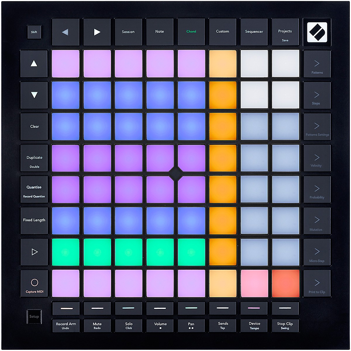
The Novation Launchpad seems cool because the pads are really the focus, and there are no knobs. I love knobs in a physical device, but when you try to cram them into a physical space, you end up with all sorts of layout concerns.
This is one of the really appealing aspects of MIDI pad controllers – they generally don’t use knobs, opting instead for single buttons that fit in the layout of the grid dictated by the pads.
You see something similar with other portable, standalone samplers and sequencers (even if they do end up using knobs.) Simple non-touch screen with grids of pads, usually one block of pads for playing/sequencing, and one for controls.
![]()
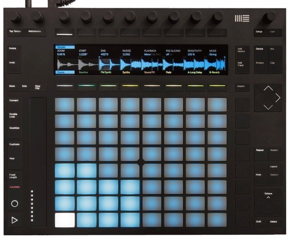
While I’ve not used the Tracker, I really like the idea of a grid of buttons that resemble the pad-grid, and are used for common keyboard-focused commands like copy, past, shift, delete, and the directional keys.
![]()
Turns out you don’t need a computer keyboard, but there are some ideas that are just plain good. A block of command keys seems like one of them.
Designing the grid
So I started with the grid. The iPad Pro 11" screen is 1194 x 834, which gives us some interesting grid patterns. For web, a common pattern I’ve seen is using units of 4px. This is great for the web, and if you’re designing for larger screens, especially if they need to be responsive, but gives us weird remainders when working with the iPad.
I started playing around with 32px and 34px variations, with 4px gaps. It’s
easier to thinking in terms of large and small “blocks” rather than units,
actually. So a block is made up of either 2 or 3 units, with padding in between.
Eg: [32px][4px][32px][4px][32px]=[104px]
This might seem really rigid, but I think there’s something to be said to setting and sticking to a grid. It forces you to build your app in the confines of physical space, rather than tacking on panels, sheets, navigation bars, and screens.
There’s also something to be said for emulating at least some of the properties of a physical device. Synths and pads are grids because it’s easier to build PCB boards that are neat and lined up.
So guess I’m just anti-skeuomorphism, but pro-grid, because I live in the physical world like everyone else.
At first I was focused on a timeline-based sequencer, with some sort of “waterfall” pattern sequencer. As I started to build it out, I toyed around with the notion of making it loop-based, so you build out loops on a different screen but play them in a grid. Like an improved Garage Band for iPad layout.
I was still finding a grid that worked well with the edges of the iPad screen, but the basics were in place here.
More work on the toolbar, selectable tracks, play-in-progress indication on individual track loops.
Clearer selection, mocking out more buttons.
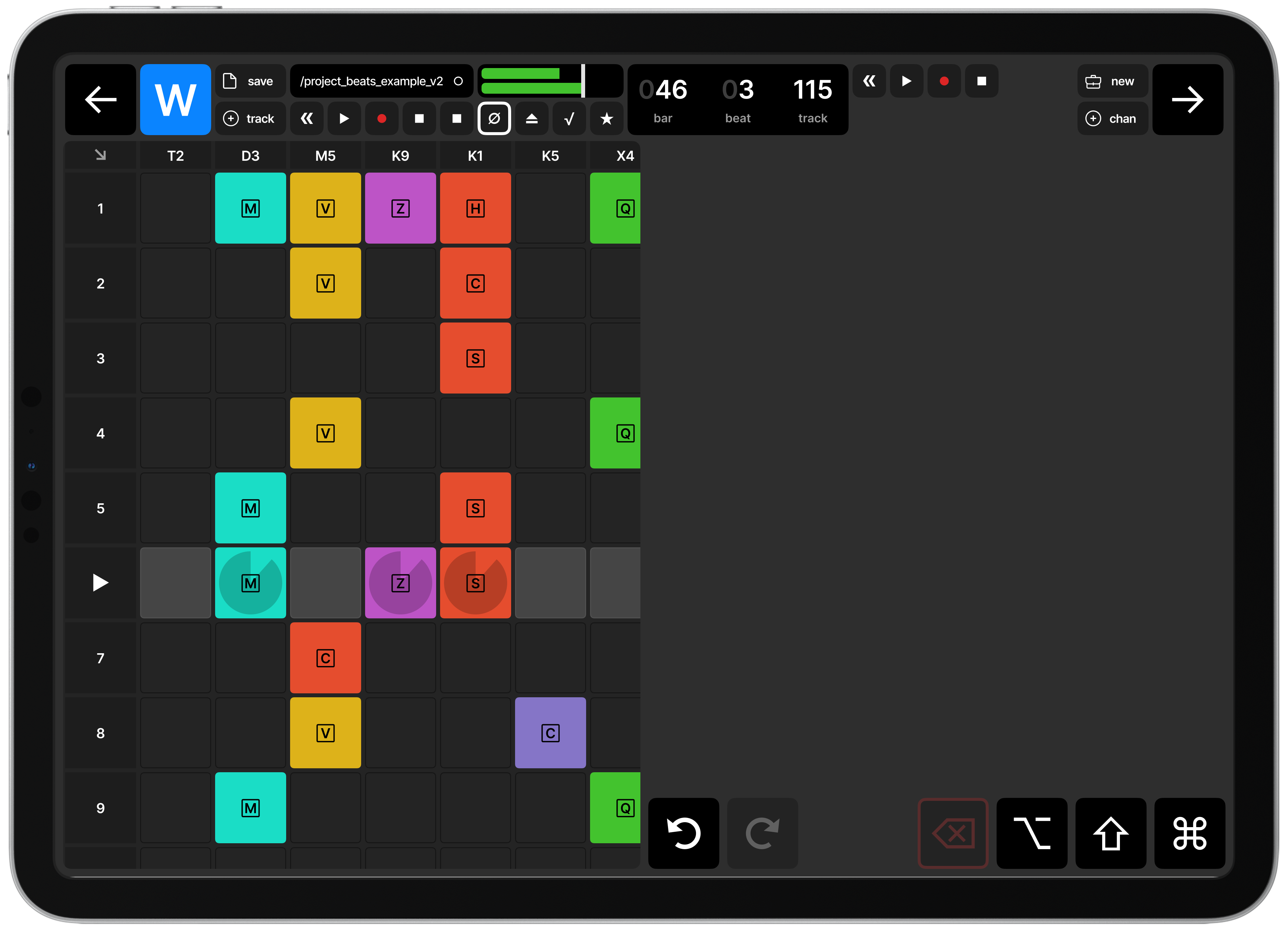
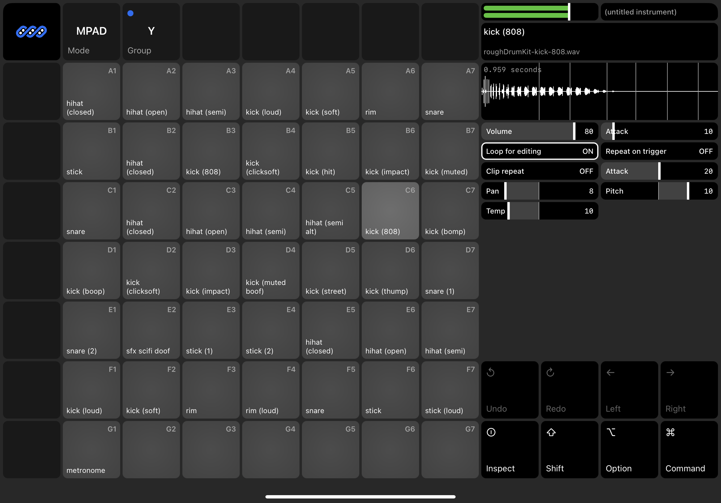
Now we’re getting somewhere; moving on to pads-only design, including pad labels, pad/sample controls, waveform with play-head. This is much more of a sampler than a performance looper app.
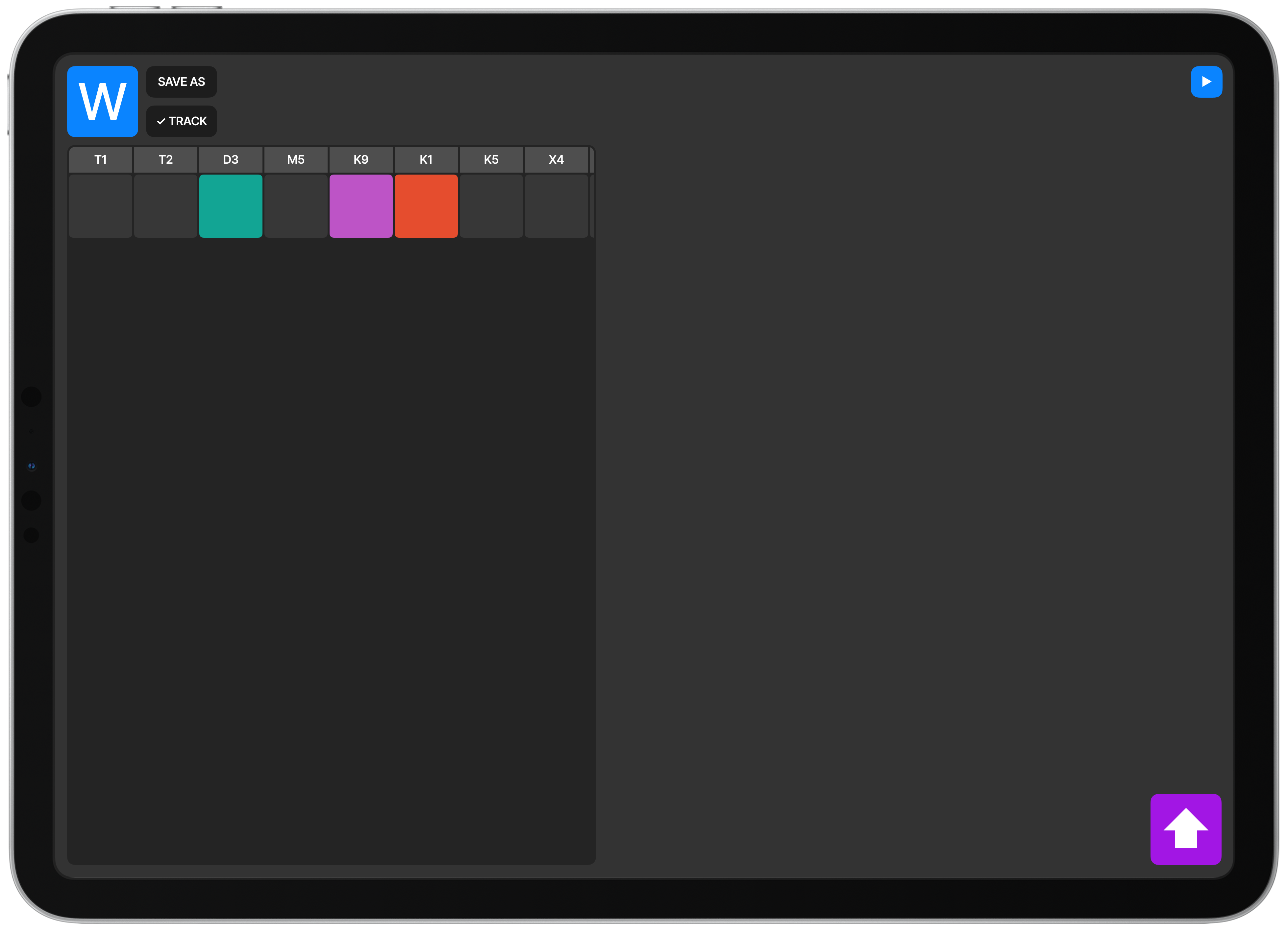
At this point I shifted to building a drum-focused sampler only. The idea was that the app would have different “modes” where one of them is a loop-based performance mode, one is a waterfall sequencer, and another is a sampler multi-pad setup. This is the sampler mode. I mocked out a lot of real parts; forward and backwards to move between modes, save/load and project info, and quantization information. I also stubbed out some icons/buttons/features to get a sense of what a fuller screen would look like.
The icons in the bottom right were intended to be meta-keys; allowing the user to select multiple pads and edit them, or inspect details of the screen, or even select, deselect, copy, paste, delete, undo, redo, add and remove samples.
You’ll notice I still haven’t quite figured out how to get a good grid that doesn’t involve a weird, little half-row below the pads and first row controls.
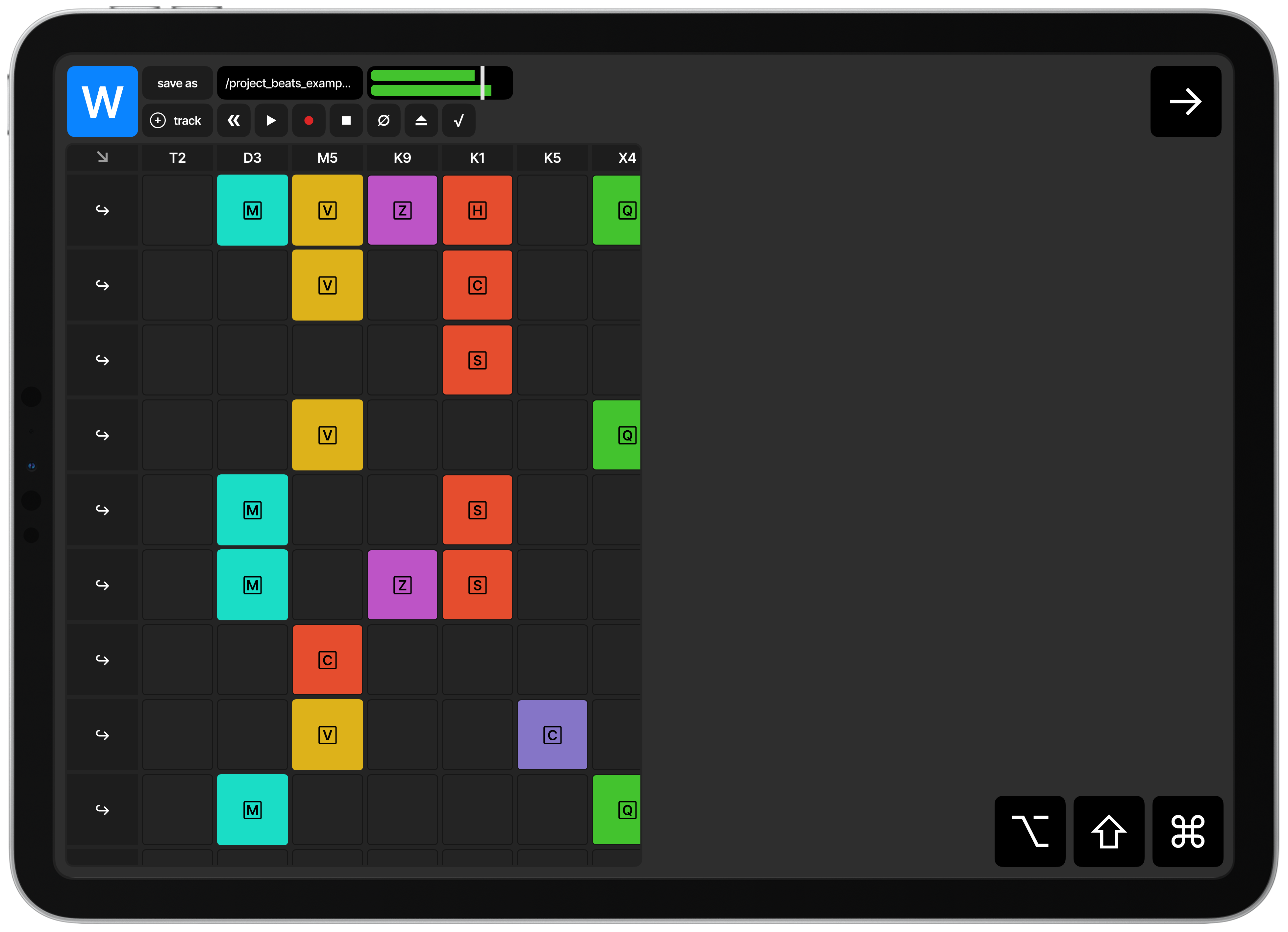
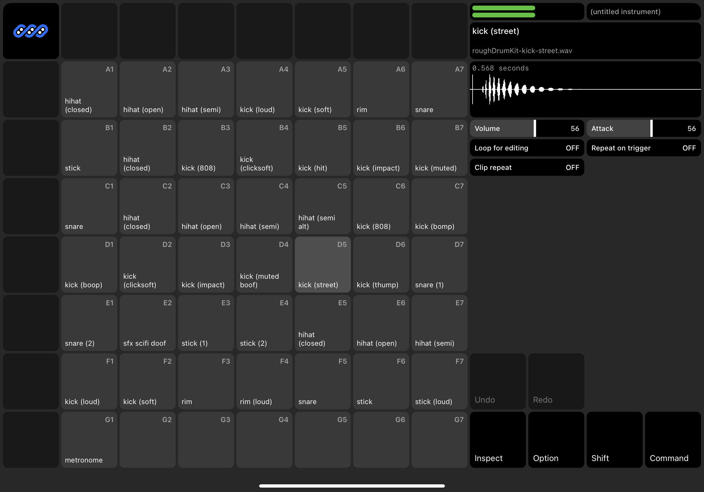
Hitting my stride here and thinking through pad-labeling and the finer properties of editing samples associated with pads. We also allow for pad selection. The idea is that users can play or select pads, and see the waveform of the sample assigned to the pad, and edit that sample by adjusting the gain, pan, offset, attack, and so on. Pads are labeled by emoji in this design, although I think that’s just a placeholder. There aren’t enough emoji to describe the specific sounds like loud and soft kick drums, light and soft snares, or sounds that aren’t really namable (how do you find an emoji for conga mixed with an 808?)
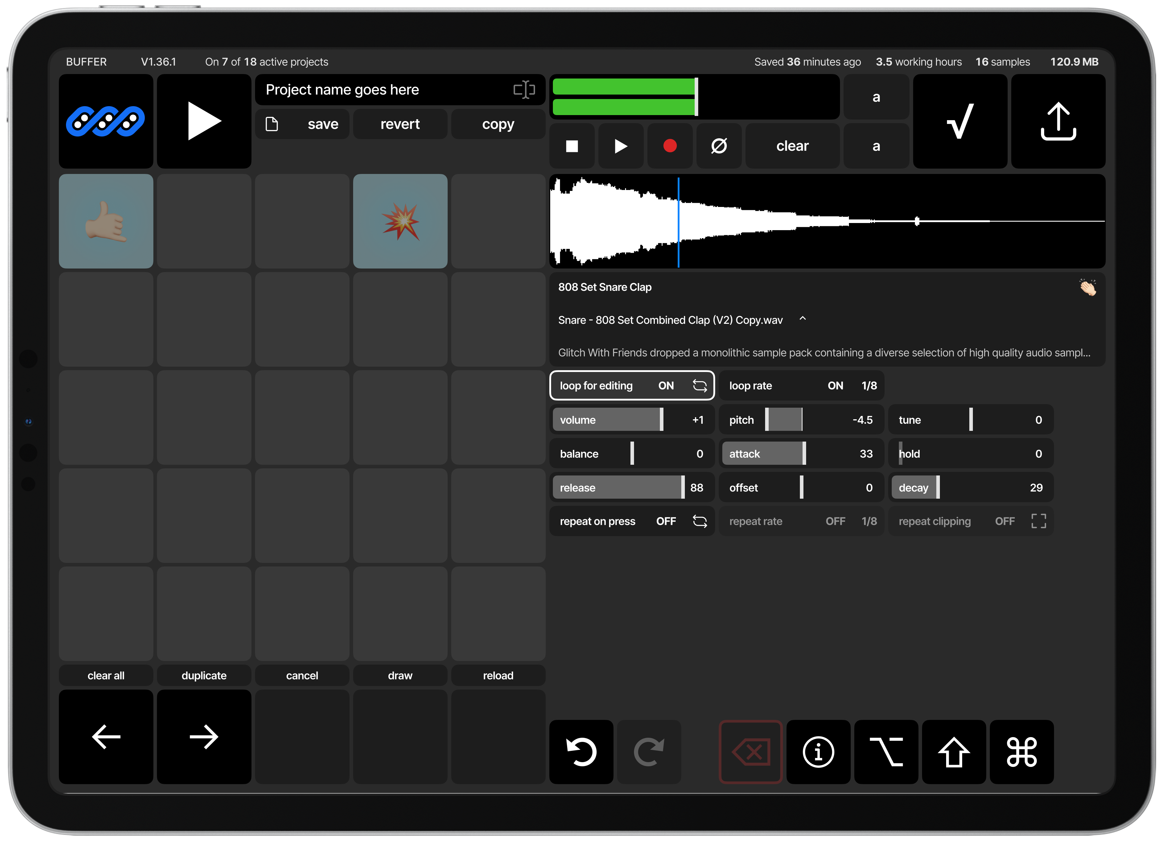
Taking a step back to actually design the controls and properties that are required, rather than just trying to fill the space. Playing around with larger units, as I thought about how big a pad’s hit zone should be to allow for actual intuitive playing.
Prototyping with Swift
Swift is cool. As a language I really like it. I learned to program with ActionScript back in 2007, and followed it up with Java and Javascript, so something that looks like Java has a special place in my heart.
It also has some really interesting parts of Rust (pattern matching and destructuring? Cool!) that make it really appealing. Add to that the fact that it uses ARC instead of GCing, and you end up with something that is – at least in spirit – more like Rust than not.
At an rate, I’m really enjoying it. It’s also partly because I’ve written Rust, Javascript, and Typescript for the better part of 3 years now, and learning a new language is a great way to feel free. It’s easy to ignore the little voice in my head about structure, clean code, and best practices because it’s all new. There are no best practices (to me) and there’s no such thing as clean code when I’m probably never going to release the source code for something like this. It’s just a little experiment. And there’s something freeing about that; building something with no expectations, or even concept of what fails or succeeds.
So I’m having a good time with Swift.
It’s easy enough to get started. Swift Playground is a great place to start, and I was able to get something grid-like and interactive on my iPad in about 15 minutes when I was tooling around in the app before bed. With another 15 minutes of work, I was able to build out a prototype using one of their example projects.
The first prototype is really just a grid of rectangles with labels and some
samples loaded through AVAudioPlayerNode. It was enough enough that part of me
wanted to load up ~300 samples a 22 x 14 grid, and just leave it at that – let
the user rearrange them in the grid, but keep everything so simple that it’s
less of an app and more of a pad-based instrument. But that’s an idea I can
always come back to, and a fuller instrument sampler would be cooler.
With very little work, I was able to programmatically load .wav files from the /Resources directory of the app, display them in a grid, and connect the pads to custom gestures that fire when the touch event is first triggered. This gets me a really fast response time that feels like you’re playing a live instrument.
The harder part turned out to be tracking individual plays, and making sure that there were enough un-played audio-nodes to allow for multiple hits of the same instrument for the duration of the sample.
For example, if a sample is 1.000 seconds long, and the user is going to play 8 of them in a second, we need to make sure that we have at least 8 audio nodes for that sample, or we’ll end up not playing the sample for subsequent plays, or we end up having to stop and replay samples mid-play.
So the rough structure ends up being something like:
class Sampler {
  samples: Dictionary<Int, Sample>
}

class Sample {
  nodes: Dictionary<Int, PlayerNode>
}

class PlayerNode {
  private inner: AVAudioPlayerNode
  private isPlaying: Bool
}
This is a bit of a weird setup, because when you play an AVAudioPlayerNode and it finishes, it still tracks itself as “playing” even though it’s done.
But the basics are there.
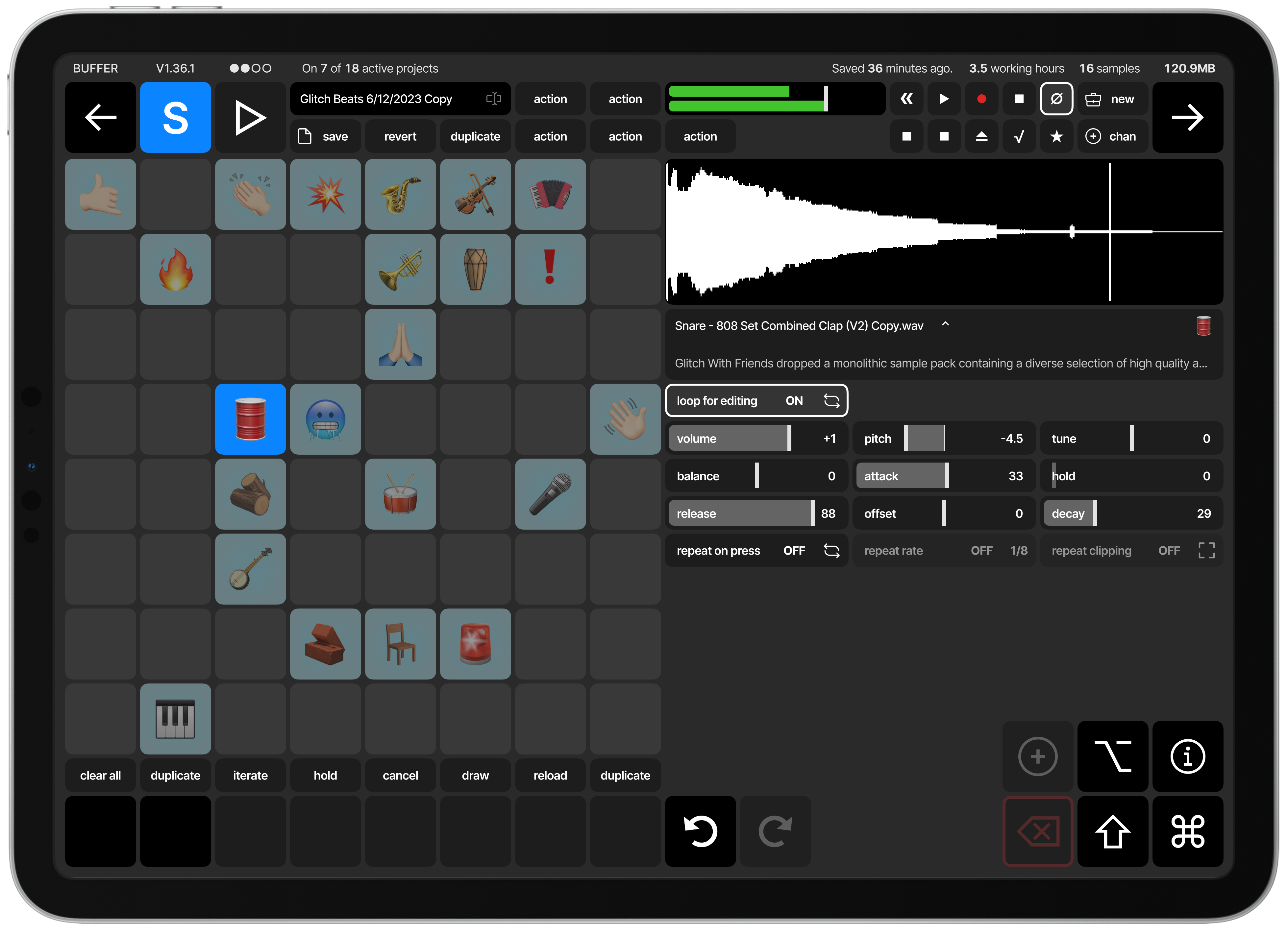
Prototyping is partly design work. So as I figured out the samples and played with them I learned more about what the minimum hit-size actually is for instruments, not just what Apple recommends (44px) in their design guides.
I also tried to figure out if there’s a better way to label samples, maybe via user-configurable colors? Maybe.
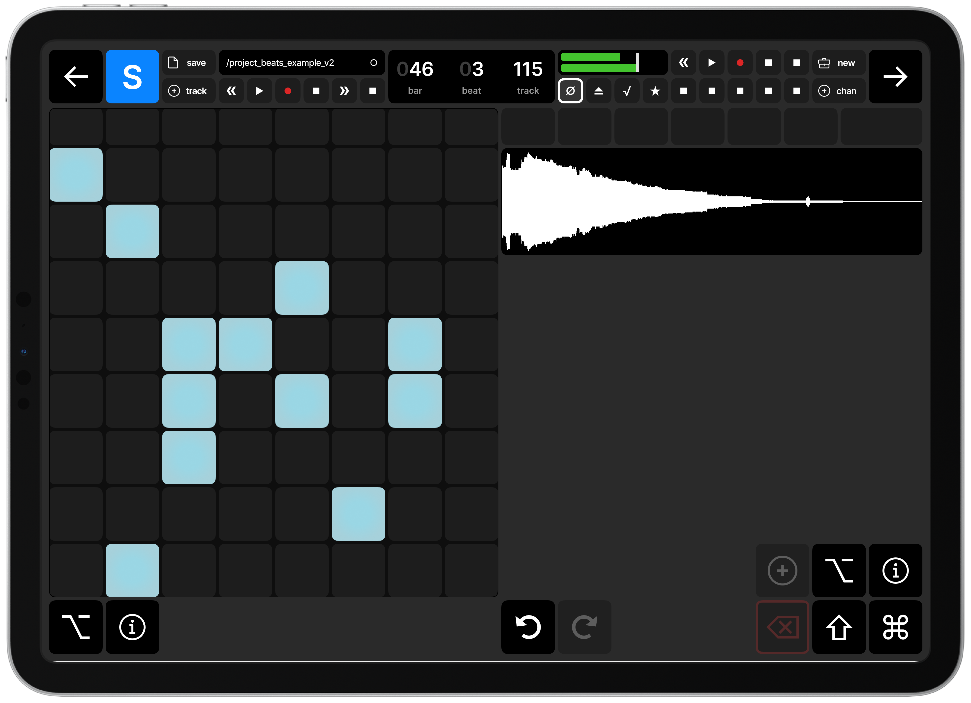
To the right you can see my misguided attempt at rendering the wave formation for a sample, something that’s challenging to get right. I eventually ended up using something similar to AudioKit’s UI kit.
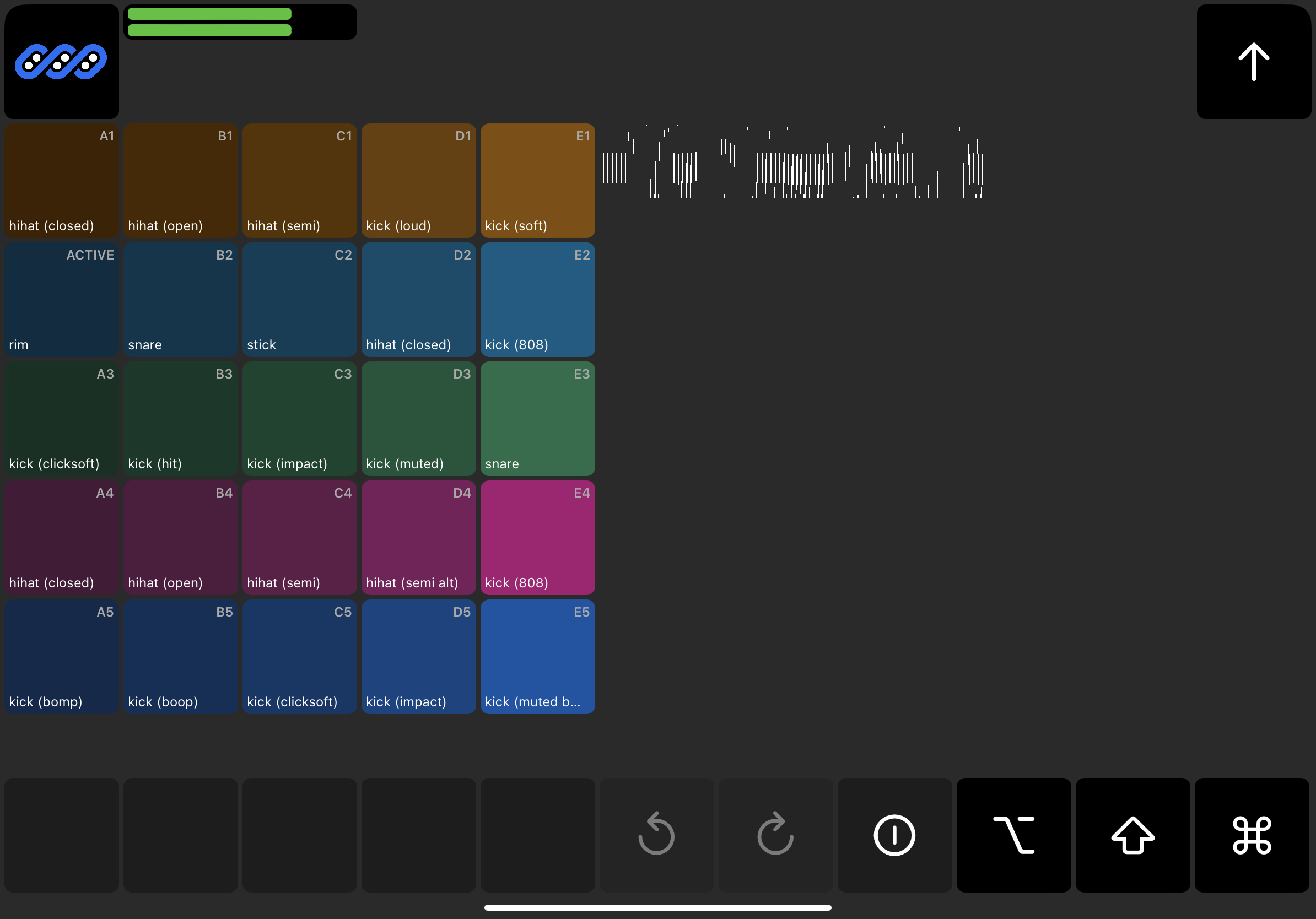
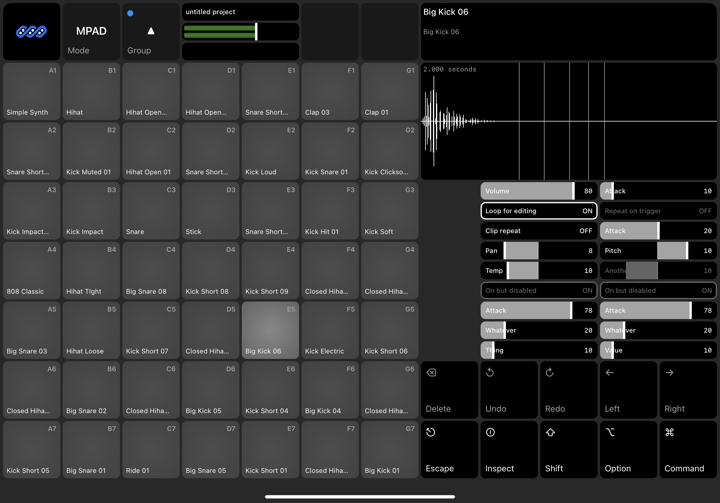
We finally have a simple wave form for the samples, which is satisfying.
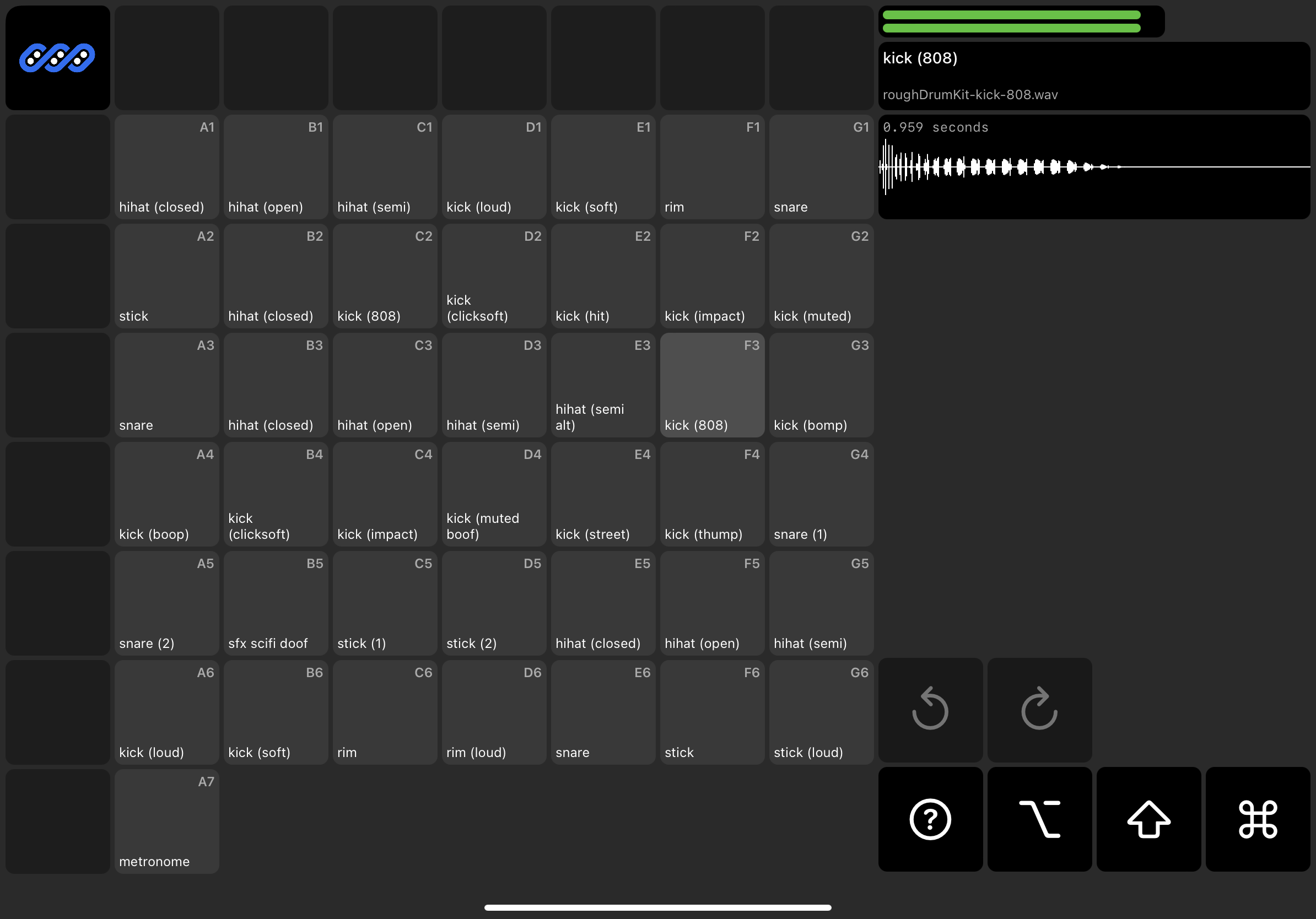
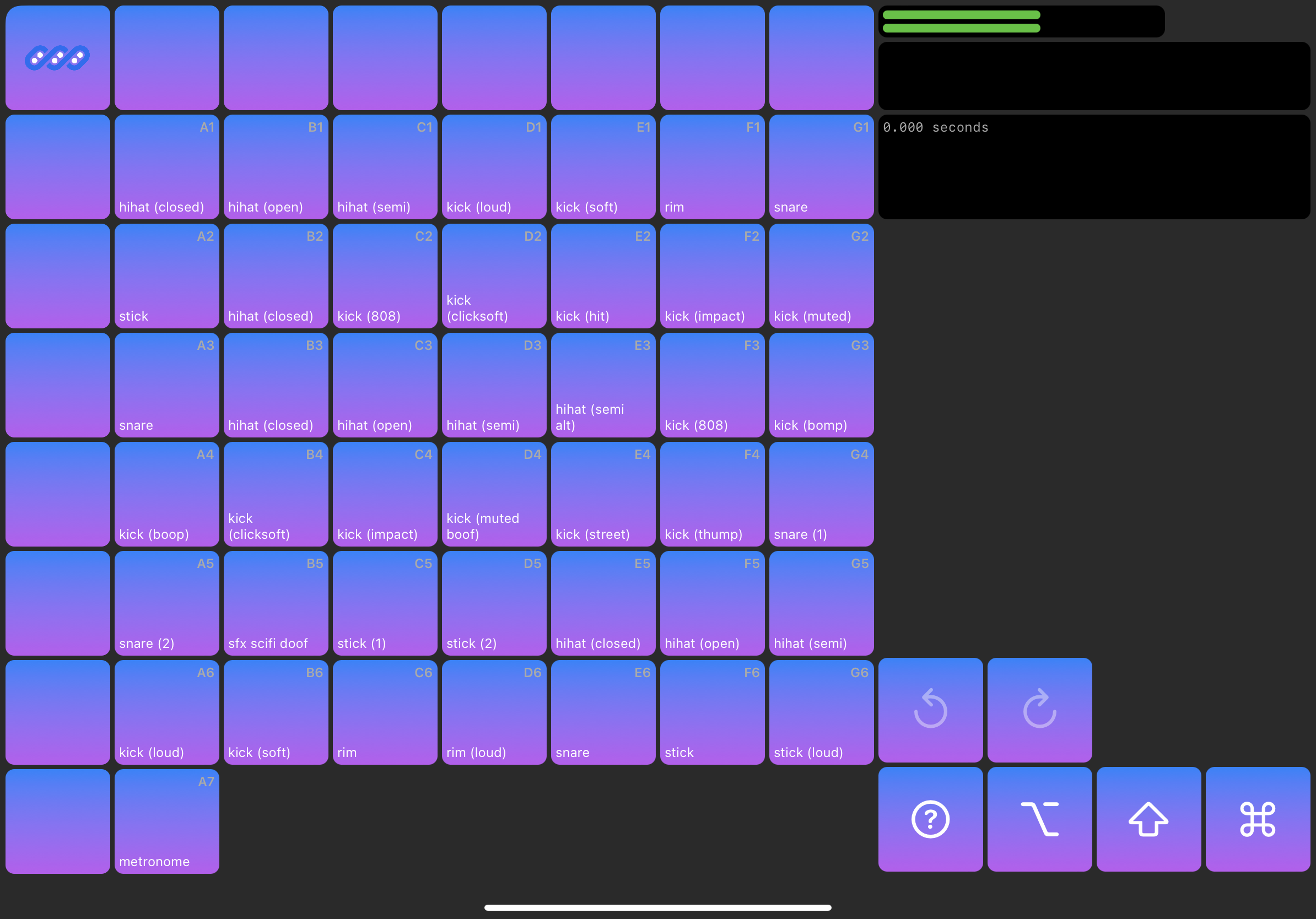
Something I like about the design of physical samplers is that the pads light up with a natural radial gradient color pattern. On my way to that I found an interesting looking gradient pattern. Didn’t keep it, but it’s something fun I made a screenshot of to remember for later. At this point I still hadn’t found a satisfying way to let users clearly label or identify individual pads.
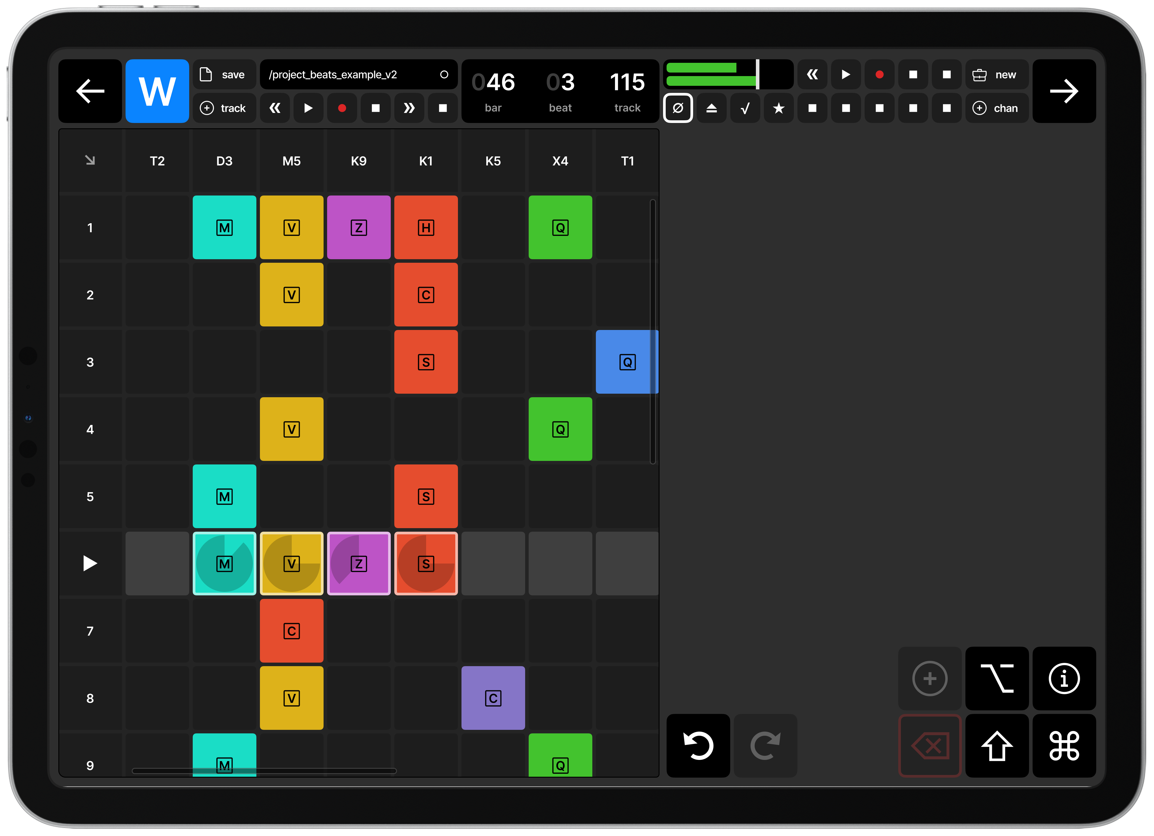
With a gentle radial pattern for the pads done, I started to experiment with the command keys in the bottom right corner, and displaying sample/pad name and information.
At some point along the way I started to think that 7x7 is too few pads. It seemed like it would be fun to allow up to 4 groups of 7x7 pads, so you can build out more sounds, and experiment more without having to load a new instrument/project.
I also still haven’t quite nailed down what an instrument or project is, but they seemed like organic units of work for someone to work on making beats or samples.
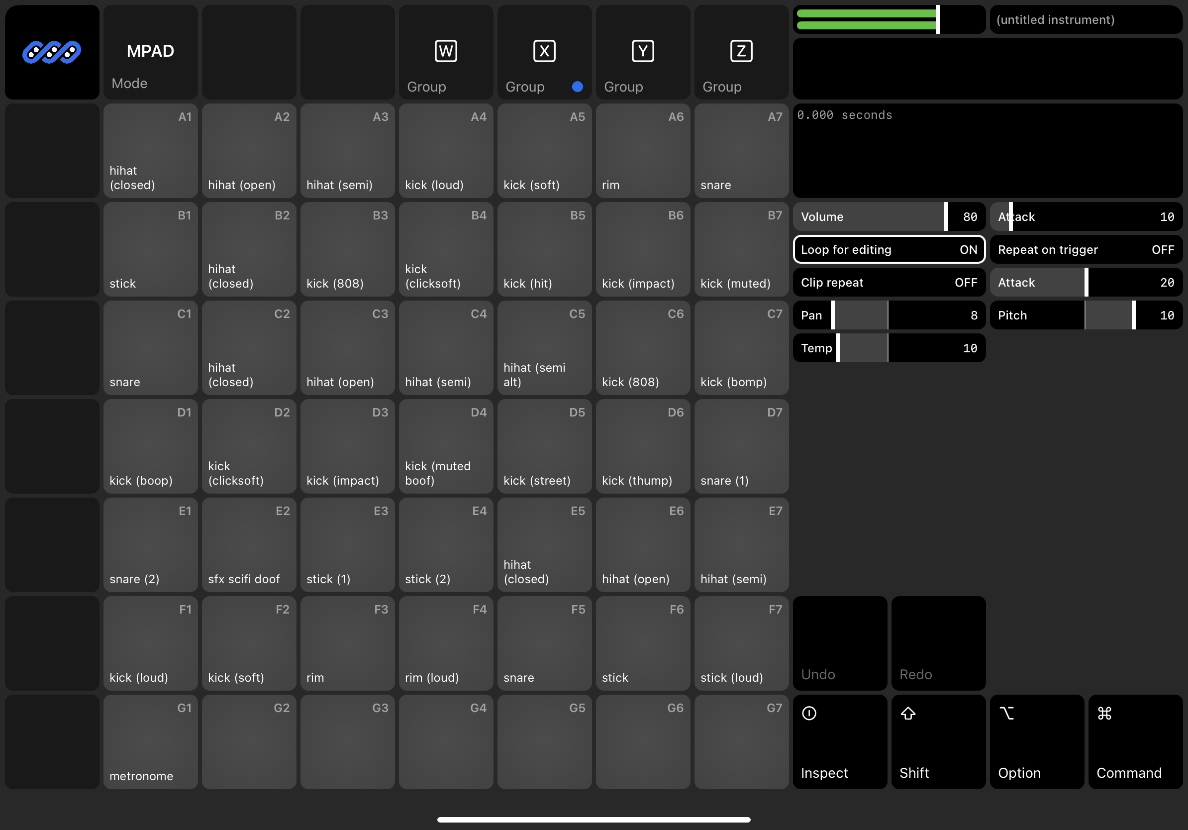
Collapsed pad-groups down to a single button in the upper left that rotates through the groups. Also found a command key button design that made sense, and felt clean.
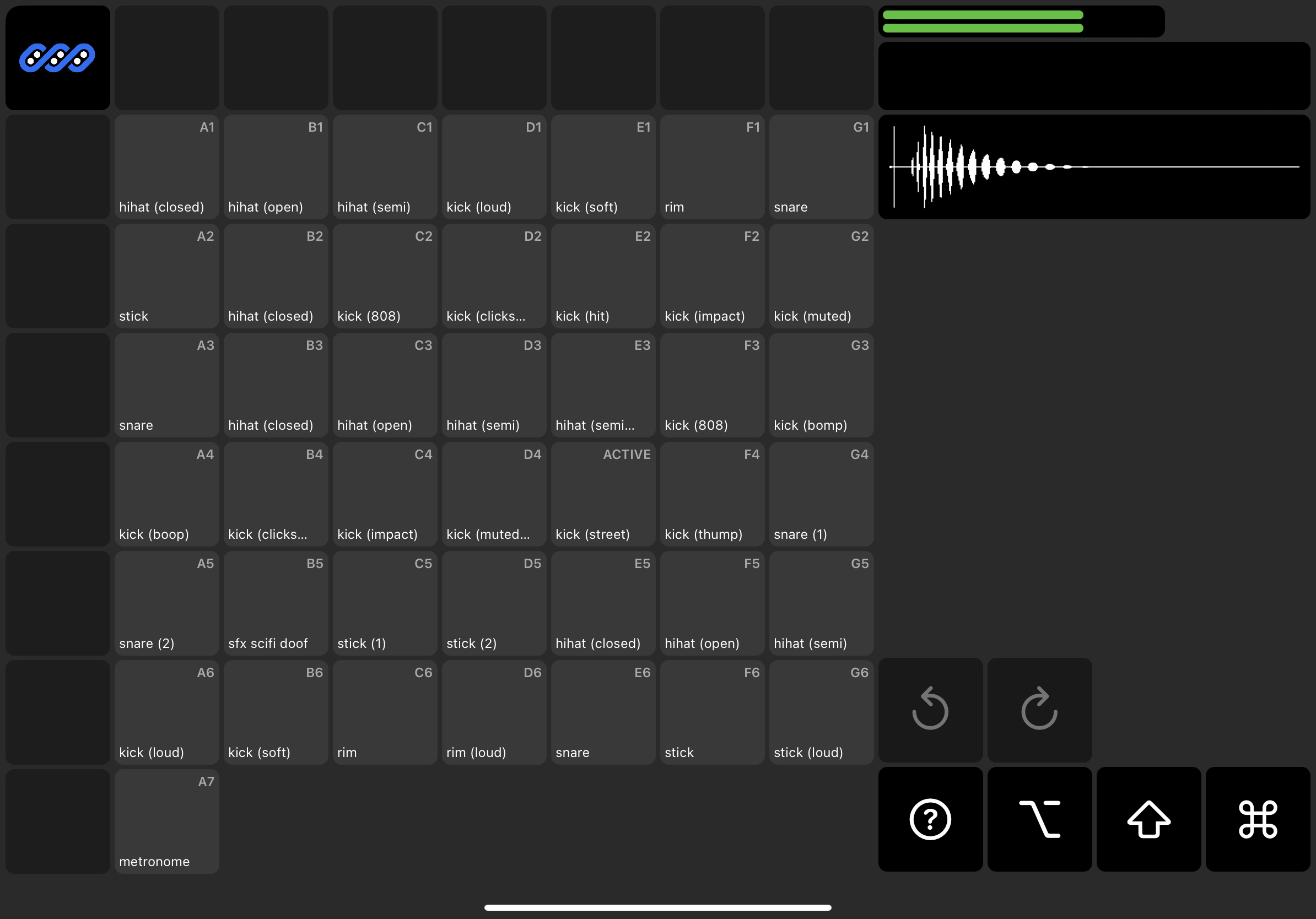
The cool part of this design is the playheads on the waveform. To get this
working I had to figure out all the intricate mechanics of how SwiftUI renders a
ForEach view, and be able to track individual “plays” of a sample, calculate
their duration/progress, and adjust the playhead accordingly.
Finally stopped messing around with blank buttons, and started devoting some space to our sample/pad details area.
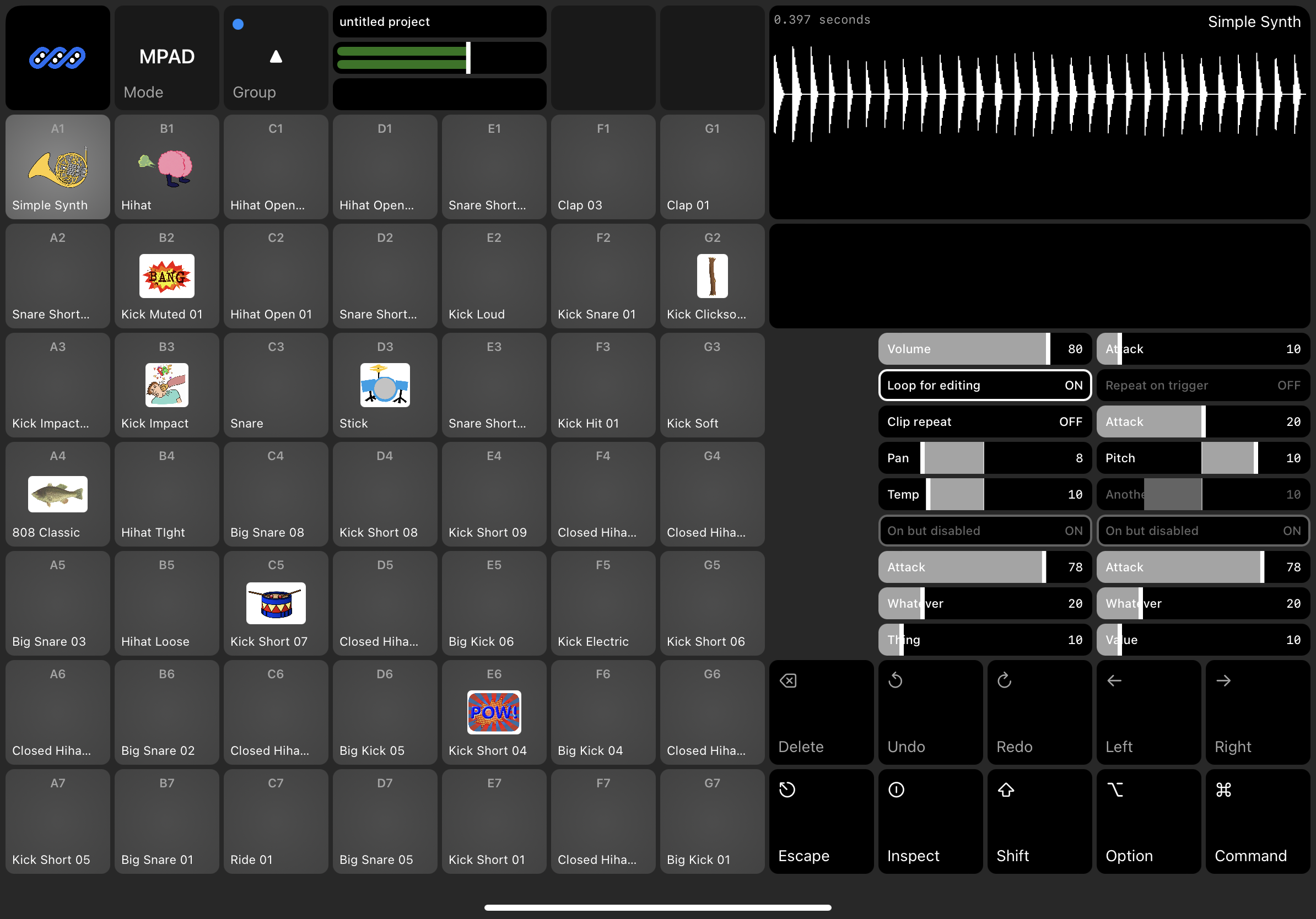
One idea that I had to label pads was to use emoji. However, I found that there are far too few emoji to represent the breath of sounds available. (Go into the emoji keyboard and type ‘drum’ and you’ll see what I mean.) A fun option I played around with is using open source early-2000s clip art. You end up with something fun and goofy, and maybe extensible.
This is where I’m leaving off for Part 1. I’ve got something mostly working, and at least playable, even if you can’t yet load your or record your own samples. I’ll save that for Part 2.